Visit California
VisitCalifornia.com is the official tourism website for the state of California, designed to inspire travel and exploration.
Role
(Appnovation)
UX/UI Designer
Team
2 UX Designers
1 Project Manager
1 Business Developer
3 Engineers
Deliverables
Research, Business Strategy, Design
Tools
Figma
Figjam
Adobe Suite
Invision
Context
Visit California has been a leader in providing inspiration for travellers looking to explore California.
Road trippers are tired of going back and forth on multiple platforms to plan out a trip.
... Each stop would have to be researched through different sources, put in a map, find the distance, and find the route
Research
Research goal: Understand the user frustration of planning trips, and their behaviour on Visit California's website
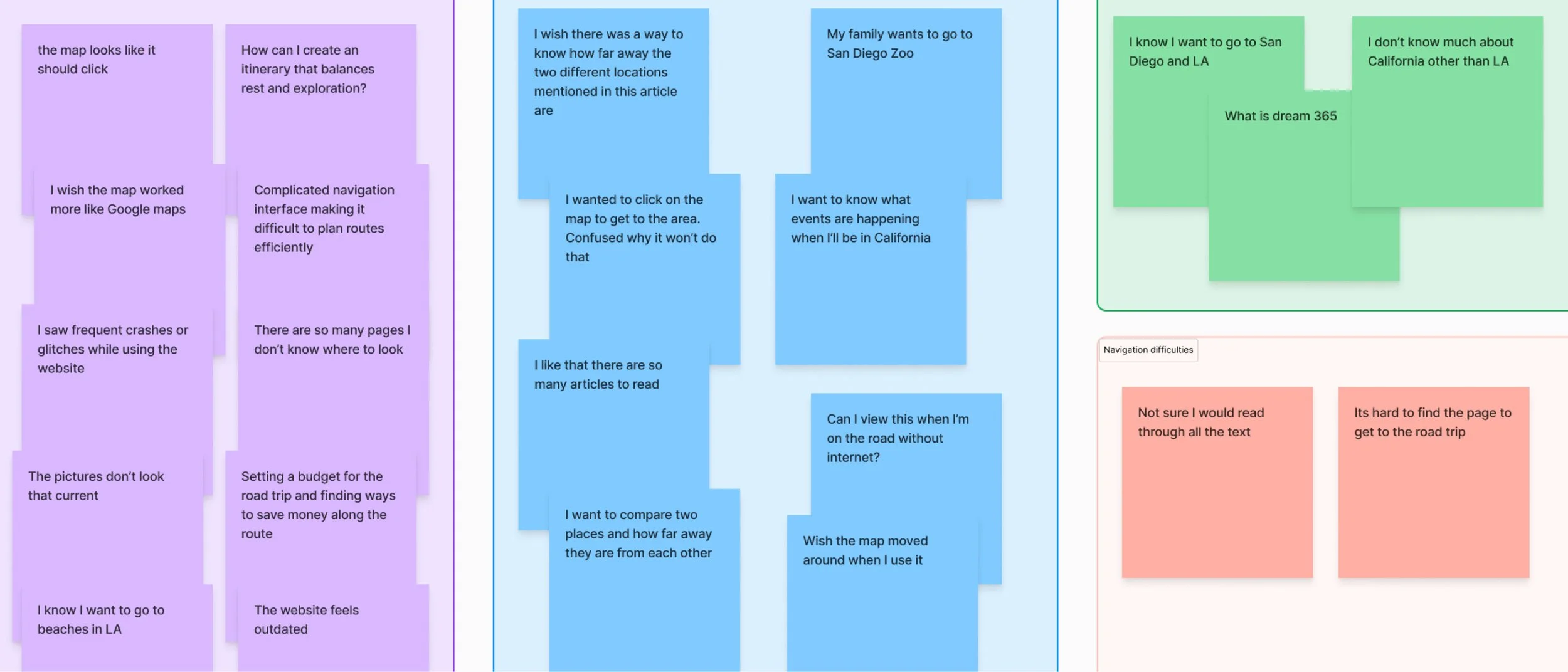
We conducted 7 User Interviews to dive into the specifics of users' planning struggles and needs, 80 surveys to gather broader insights into how users currently planned their trips and Secondary Research to dive into the specifics of users' planning struggles and needs.
User Interview Feedback on Visit California's website
These were the key findings that were identified:
City as Keywords
Users planned trips around familiar cities. We realized users needed to search by city to feel confident in their trip plans. This showed that users are already familiar with California and had places in California in mind
Static Maps & Confusing Navigation
Users were frustrated by static maps and difficult navigation, which led to high drop-off rates. Users wanted dynamic, interactive maps that could show points of interest and allow direct itinerary creation
Online-Only Availability
Users wanted the itinerary available offline, especially for remote areas with limited connectivity
Some other findings we noted in asking what users find important when researching road trips are; road trips based on their personal interests, reliable information that feels current, tool that helps them plan their trip.
Areas of focus
Using the insights, we brainstormed several key focus areas that could simplify and enrich the user experience:
Simple
Users want their trip planning to be simplified - they don't want to be comparing multiple platforms, with guarantee that the information is reliable
Accessible
There are different type of vacation planners - those that were planning on a map, and those that were looking at itineraries. We wanted to have an option for both types of planners
Solution
Create a one stop platform that allows road trippers to plan out their trip that caters to the different interests, length of trip, and region of California.
while solving the business need to having increase in user engagement, boost in brand identity.
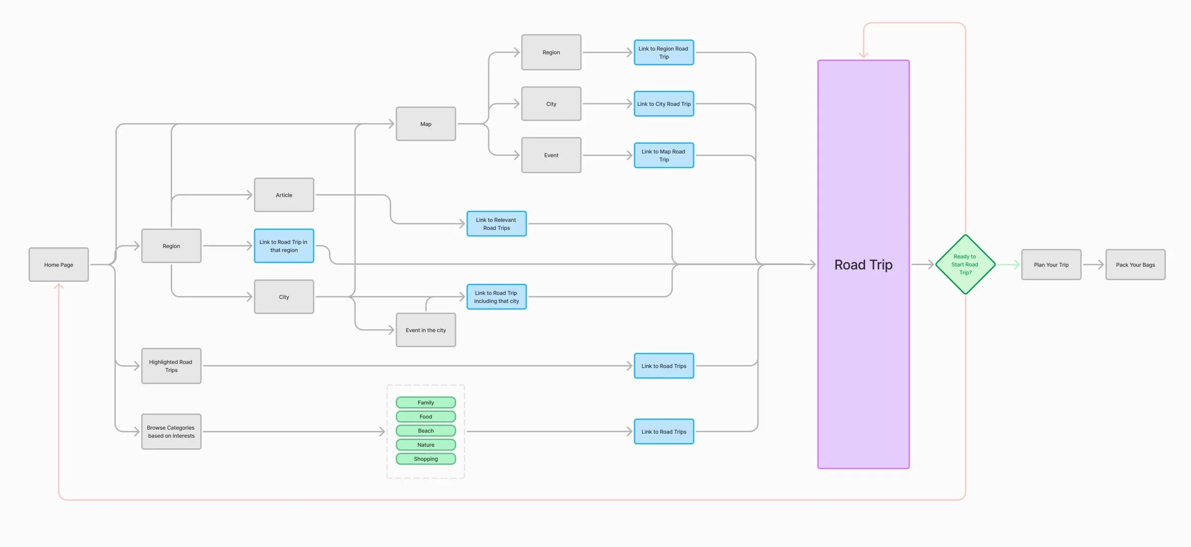
User Journey
To ensure an optimal user experience, we carefully designed and verified the user flow, mapping each step from the entry point to the final interaction. I focused on two primary user paths: Map view vs Page view - these paths ultimately lead to Road trip hub which is the end goal for the user. This iterative approach allowed us to efficiently refine the user journey while ensuring alignment across design and development teams.
User Journey of road trip planning
Visual
Being visually inspired is a huge determining factor in choosing a place to visit. We wanted to make sure that each location would be highlighted so that it is visually appealing
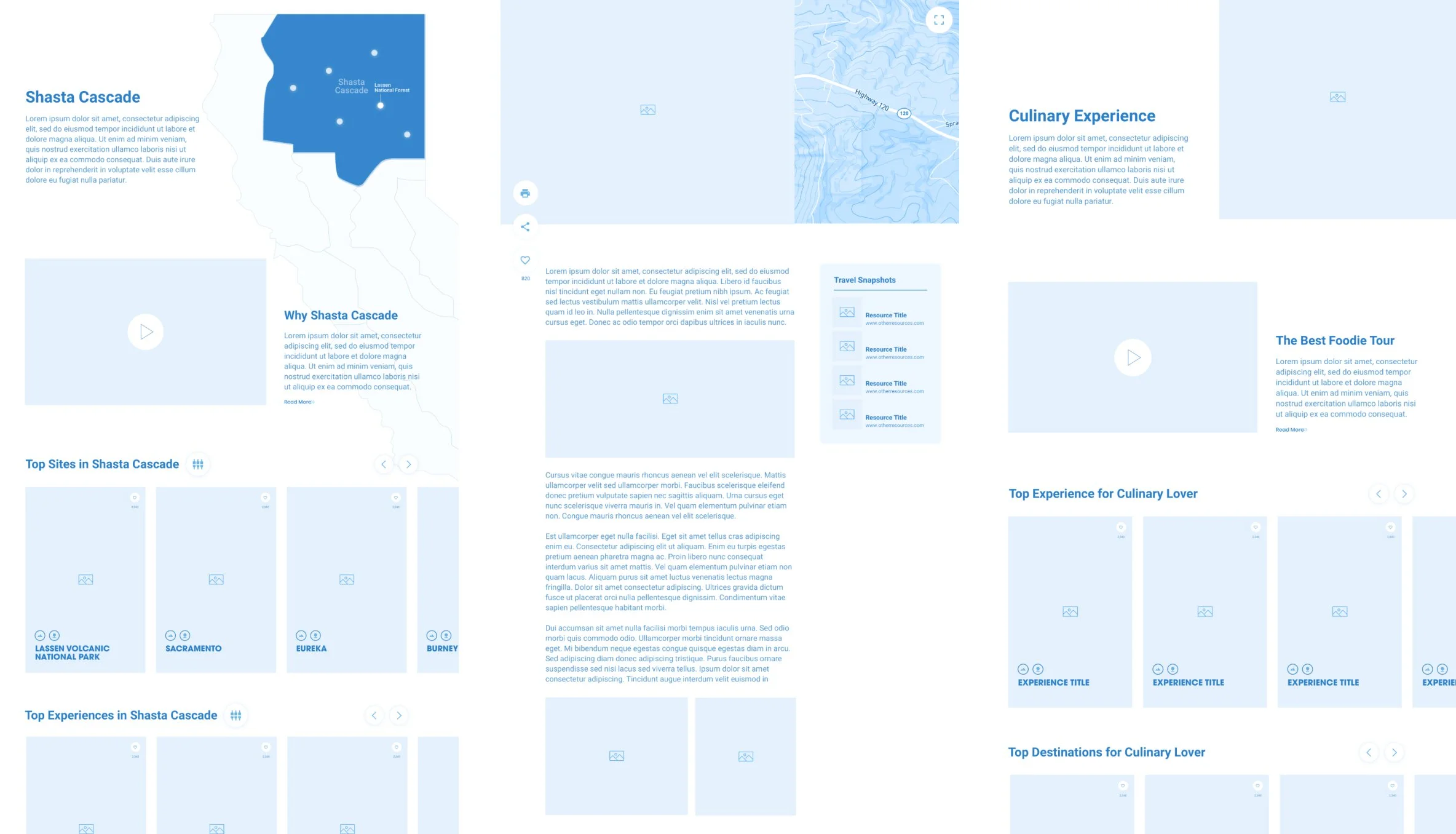
Wireframe
To kickstart the design, I created initial wireframes and low-fidelity prototypes in Figma. These were tested internally with cross-functional teams, where we gathered feedback on layout and feature placement.
Wireframes
Feature 1
Card-based Layout
Based on the insights that users found it hard to locate relevant information quickly, we introduced a visually rich card-based design. Each card represented a trip stop, with images, distances, and short descriptions.
Interactive Map
Screenshots of existing website pages
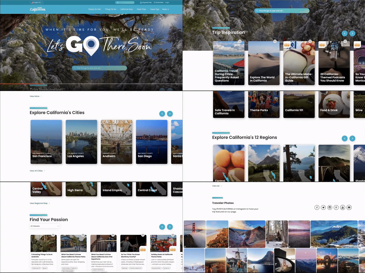
The current design layout significantly lacks consistency, clear hierarchy, and clickable links or buttons, making the content too long to read, resulting in high drop offs. We aimed to simplify the designs overall, ensuring that the card information is much easier to read and comprehend for all users, regardless of their experience level with the platform.
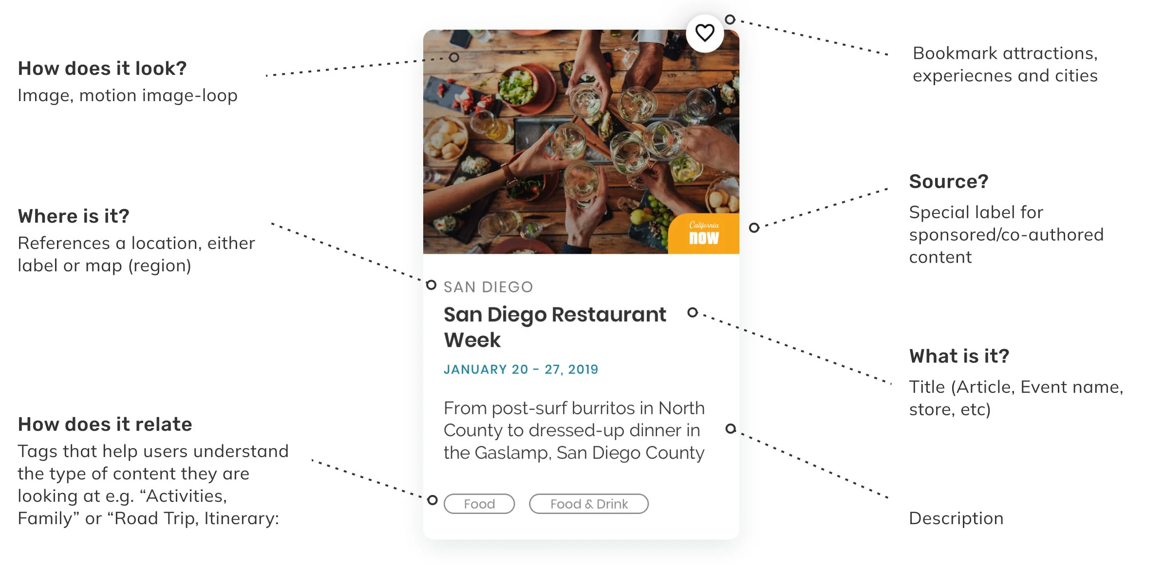
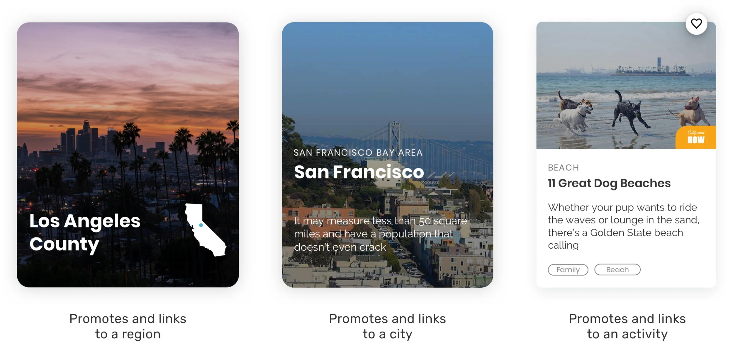
New Unified Card Design
These are variations of the cards that are used throughout the website. Each card represented a trip stop, with images, distances, and short descriptions. The visual images inspire users to click to find out more about the information, while providing a clear sense of what the card represents.
Visit California Magazine
There were a few compelling reasons for taking a split screen approach in this particular design context. This layout effectively provides a clear and distinct visual separation between two separate sections of content, while simultaneously enabling the user to view multiple pieces of information at the same time. Additionally, it created a strong visual emphasis that guided the user's attention; the split-screen layout allowed users to read detailed trip descriptions on one side of the screen, while concurrently interacting with a dynamic map on the other side. This thoughtful design choice not only made the trip planning process visually engaging and enjoyable, but it also allowed users to absorb a greater amount of information in a more efficient manner at once, enhancing their overall experience. The split screen design cleverly gave the visual side of the screen an opportunity to double up as an interactive map view, adding another layer of functionality.
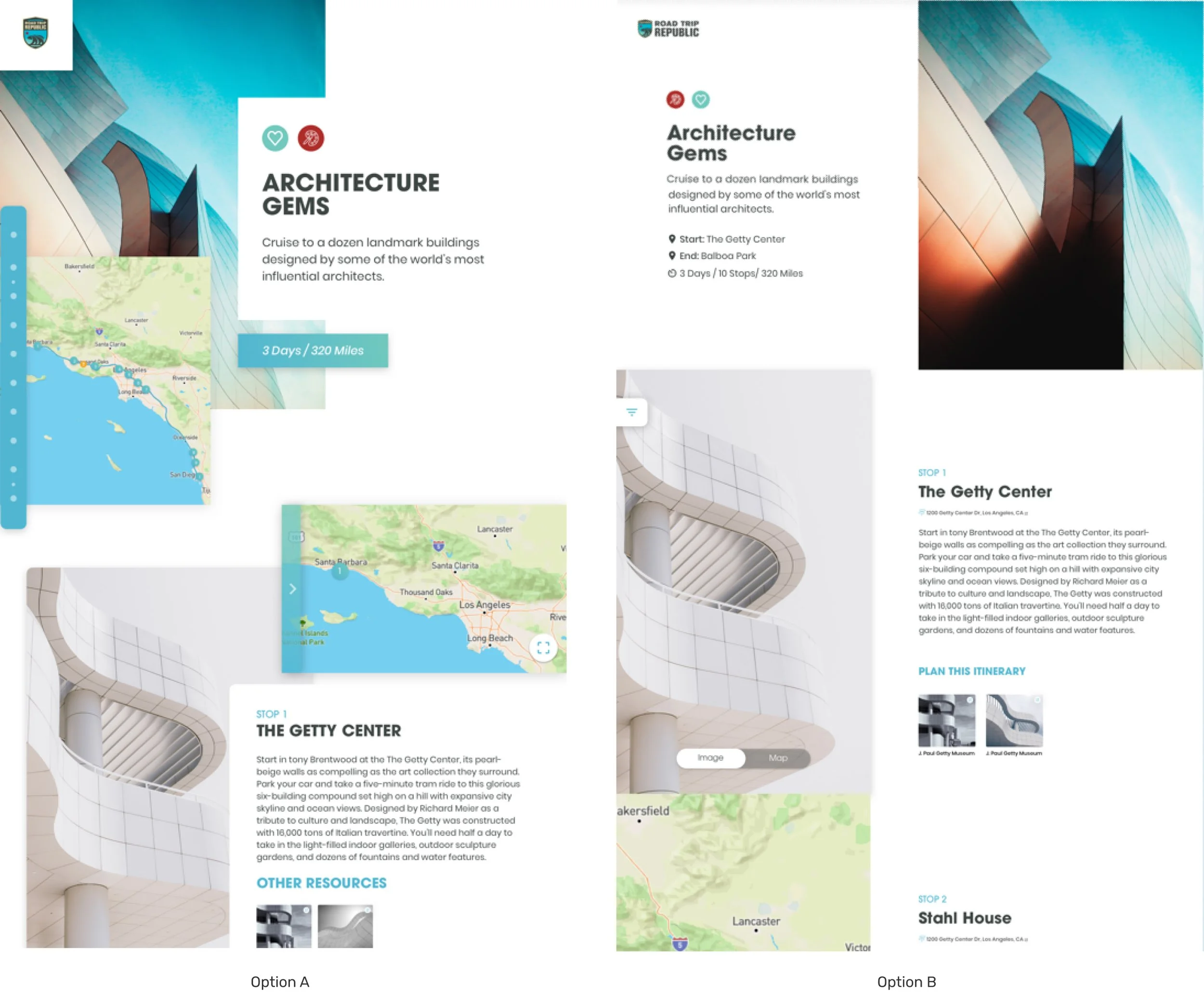
Mock options for Magazine style
We explored two variations of the magazine layout:
Version A featured dynamic elements on both sides of the screen, creating movement as users scrolled. It was visually striking, with engaging, interactive components.
Version B had a traditional magazine spread feel, with interaction focused on one side—visuals on the left and detailed information on the right—offering a simpler, more static layout.
We chose Version A for its clean yet dynamic design. It maximized space for both the image and map views of each stop while maintaining visual impact and a sense of movement.
In depth look at each of the stop
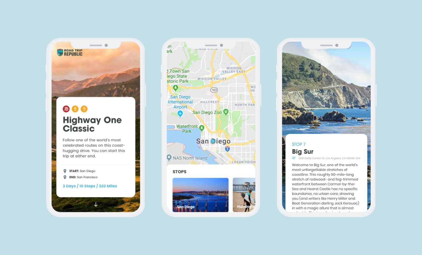
Mobile screens of RoadTrip
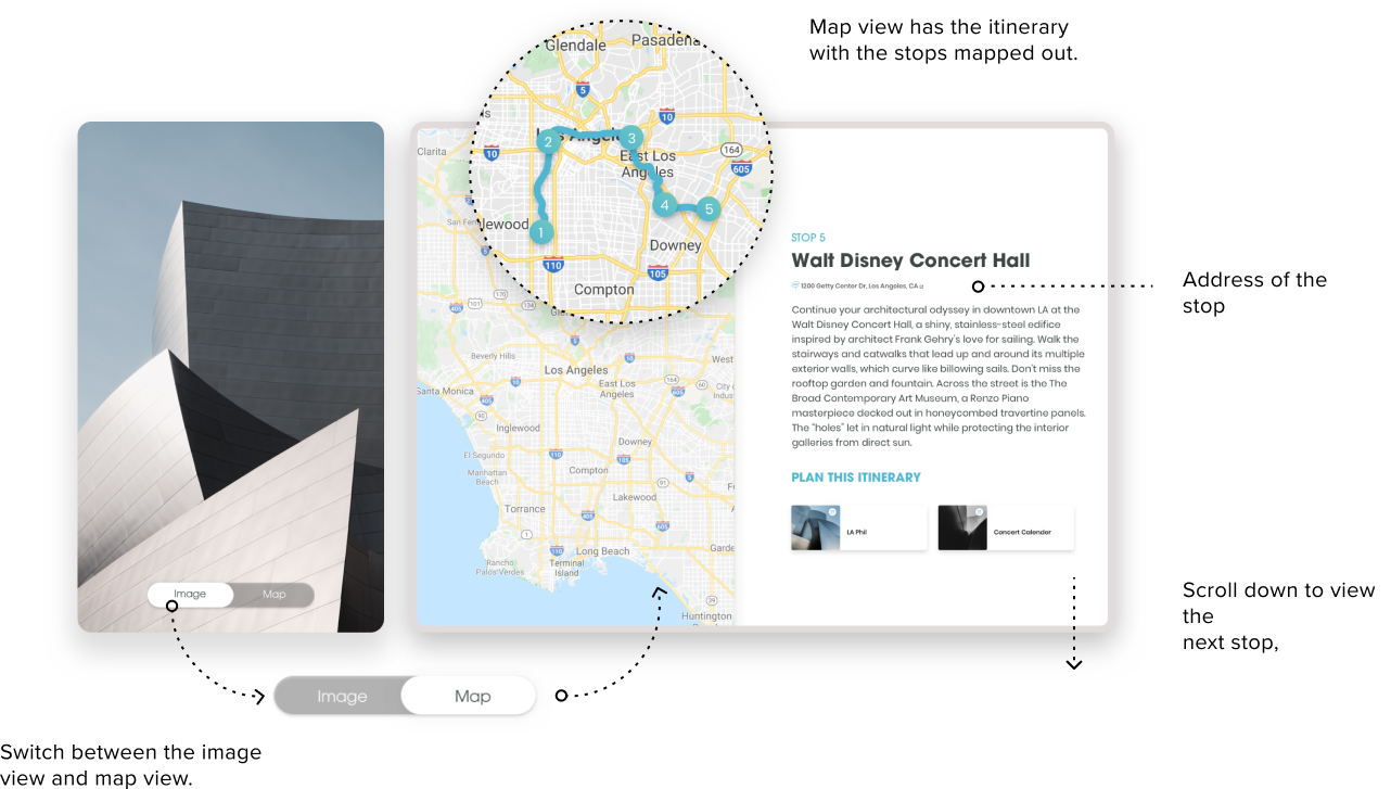
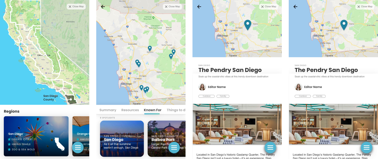
The mobile view is just as dynamic and visually impressive as the desktop view. The whole screen is a toggle of image and map, with an overlay of the detailed information on the stop.
Feature 3
Interactive Map
Users were frustrated by static maps and difficult navigation, which led to high drop-off rates. Users wanted dynamic, interactive maps that could show points of interest and allow direct itinerary creation.
Map view & Location Map view
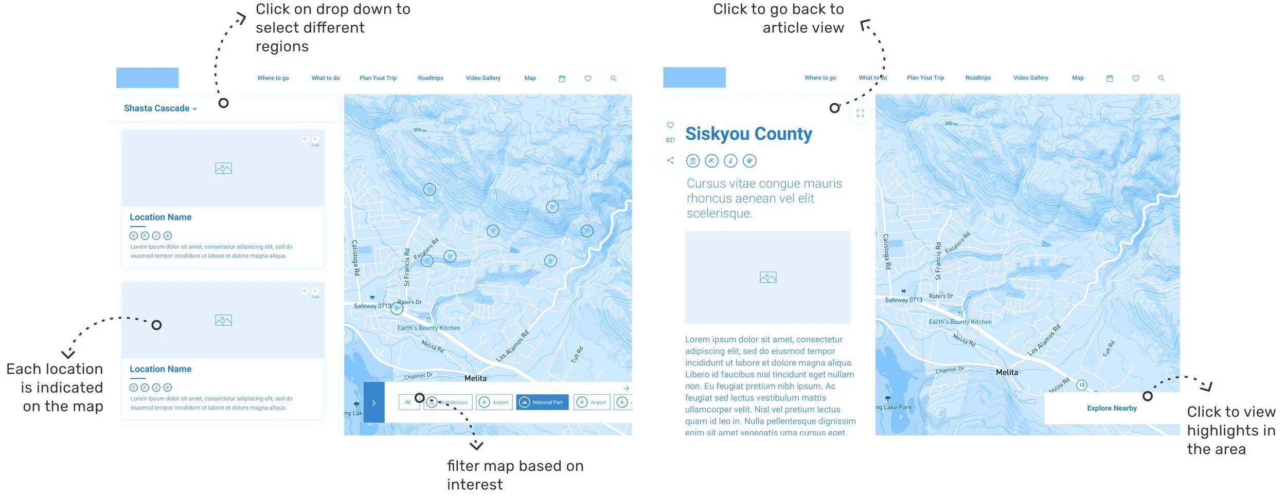
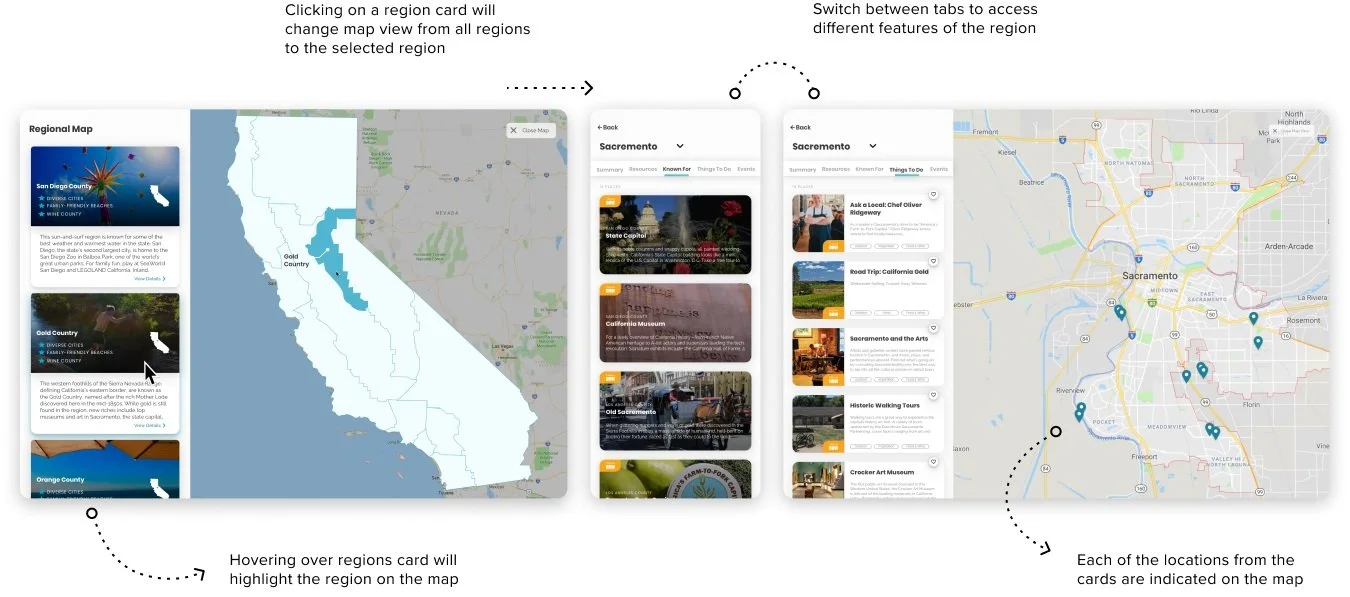
Users wanted to gather as much information as possible within the map view. To meet this need, we maintained the split-screen design to maximize space and provide detailed, location-rich map information. This view caters to visual planners who prefer organizing trips by optimizing their travel itineraries.
Clickable Interaction
We ensured users could access the same information in the map view as they could by navigating the website. The drop-down menu allows users to switch between regions, select cities, and explore stops and activities, with the map dynamically updating based on their selections.
Mobile screens of Interactive Map view
Another user pain point was that the information was only accessible online. Considering the needs of road trippers, we created a downloadable version of the road trip that could be viewed and printed offline. This version includes a snapshot of the stops, links to a Google Maps route with step-by-step directions, and a text itinerary containing all the key trip details.
in repeat visitor
Card design hierarchy
Offline options for itinerary
Metrics
Visit California Road Trip Republic is available in 17 regions and in 9 languages for a personalized experience, for road trippers anywhere in the world. If a user is interested in a specific road trip, they can download a snapshot itinerary with all of the details they’ll need. The new Road Trip Republic has brought a fresh update on the Visit California design offering, as well as being able to provide a one-stop show for travellers that like to experience their trip on the road.
78% Increase
By addressing the main pain points and consolidating the planning process, we made the site more useful and engaging.
65% increase
Users explored more destinations within California, suggesting they found more value and interest in the updated content structure.
in pages visited per session
loading times
2.7x faster
The streamlined structure and efficient code enhanced the user experience, especially for mobile users, resulting in faster loading and higher engagement.
Feature 2
Visual Roadtrip
Inspired by magazine spreads, the split-screen layout allowed users to read detailed trip descriptions on one side while interacting with the map on the other. This design choice made trip planning visually engaging and allowed users to absorb more information at once.
Wireframe of visual layout

