ASCD
ASCD (Association for Supervision and Curriculum Development) is a non-profit organization founded in 1943 with the mission of providing tools for all educators including superintendents, teachers, principals, and professors.
Role
(Appnovation)
UX/UI Designer
Team
2 UX Designers
1 Project Manager
1 Business Developer
3 Engineers
Tools
Figma
Figjam
Adobe Suite
Invision
Deliverables
Research, Business Strategy, Design
Challenge
Educators found it difficult to locate resources on the ASCD platform
Educators and administrators reported frustrations when navigating the ASCD platform. Our user interviews revealed that the resource library lacked intuitive categorization, making it challenging for users to locate specific teaching materials. Analytics showed a 60% drop-off rate on the resource search page, confirming that users were abandoning their searches due to frustration.
The business goal was to improve resource discoverability, thereby increasing user engagement and retention on the platform.
UX Audit
Research goal: Understand the user frustration with navigating resources and identify content engagement patterns
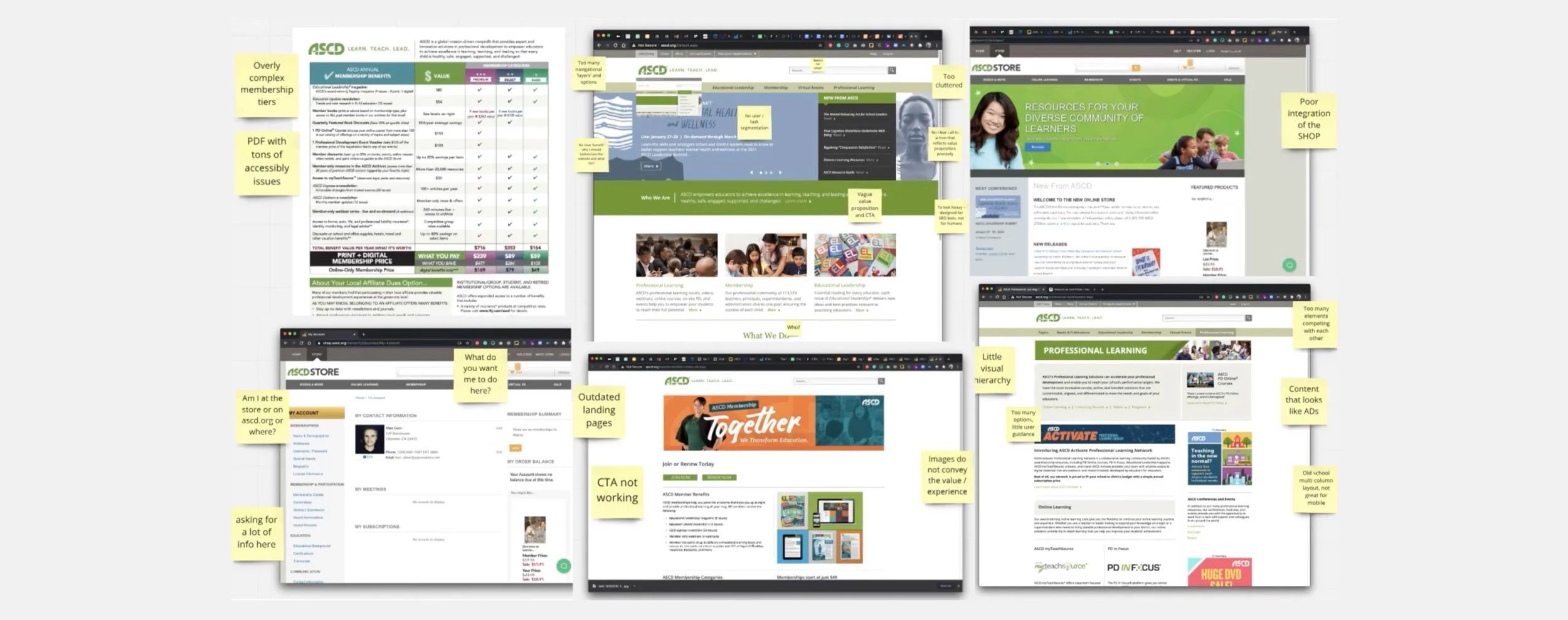
A UX audit of the existing site revealed significant challenges. Over the years, an accumulation of content pages had cluttered the site and weakened the brand identity. This clutter also led to a confusing and frustrating navigation experience, making it difficult for users to find the information they needed. As a result, the brand began losing users to newer, more streamlined competitors in the market.
Key Findings
Interview
We reached out to existing users through surveys and interviews to understand the ways they look for resources, their use of ASCD, and where the gaps lie.
Audit of existing pages on ASCD
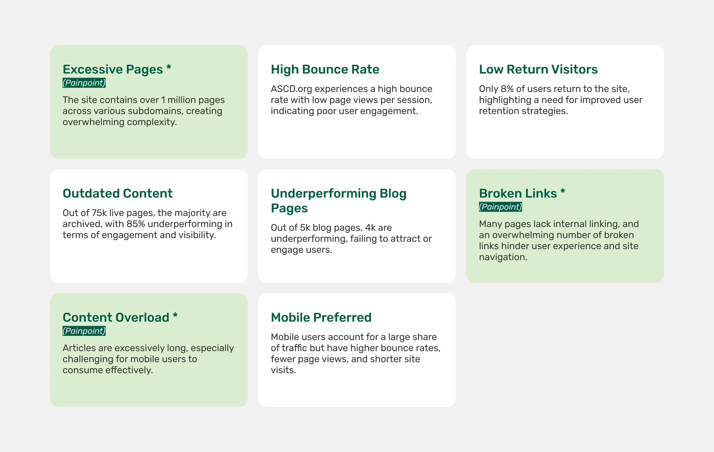
Key findings from Audit
Research Findings
Users:
Want to easily find what they are looking for
Want to come back to read article
Want the ability to save or share articles easily
We want to answer
How do the users want to consume content? How do we want them to consume content?
How might we increase engagement with users so that they come back daily/weekly?
How can we most effectively onboard new members?
How can we shape users habits so it benefits the business as well as the users’ learning goals?
Early Approach
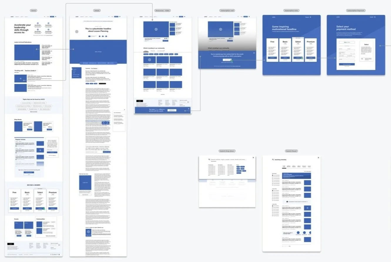
We started by creating a detailed user flow to map the entire experience—from accessing an article to exploring the site, viewing video content, and completing the subscription process. This flow helped us identify the key pages that required attention and improvement.
Information Architecture
Problems
Confusing navigation due to excessive pages and unclear labels.
Overwhelming and lengthy articles, especially for mobile users.
Low user retention (8% return users).
Broken links and poor internal content linking.
Overflowing topics - over 30
New Navigation Style - Search & Topics
Wireframe on key pages
As we developed the wireframes, we took a deeper dive into refining crucial elements such as intuitive navigation, ensuring design consistency across the platform, and introducing features like personalized learning tools. These additions aimed to support users in building effective learning habits while improving overall engagement with the platform.
Goal
Design a tool that helps users effectively engage with long-form content, making it easier to read, navigate, and interact with. Simultaneously, the tool should address the business objective of increasing user retention by encouraging users to return to the platform daily for ongoing engagement.
Feature 1
Streamlined Navigation
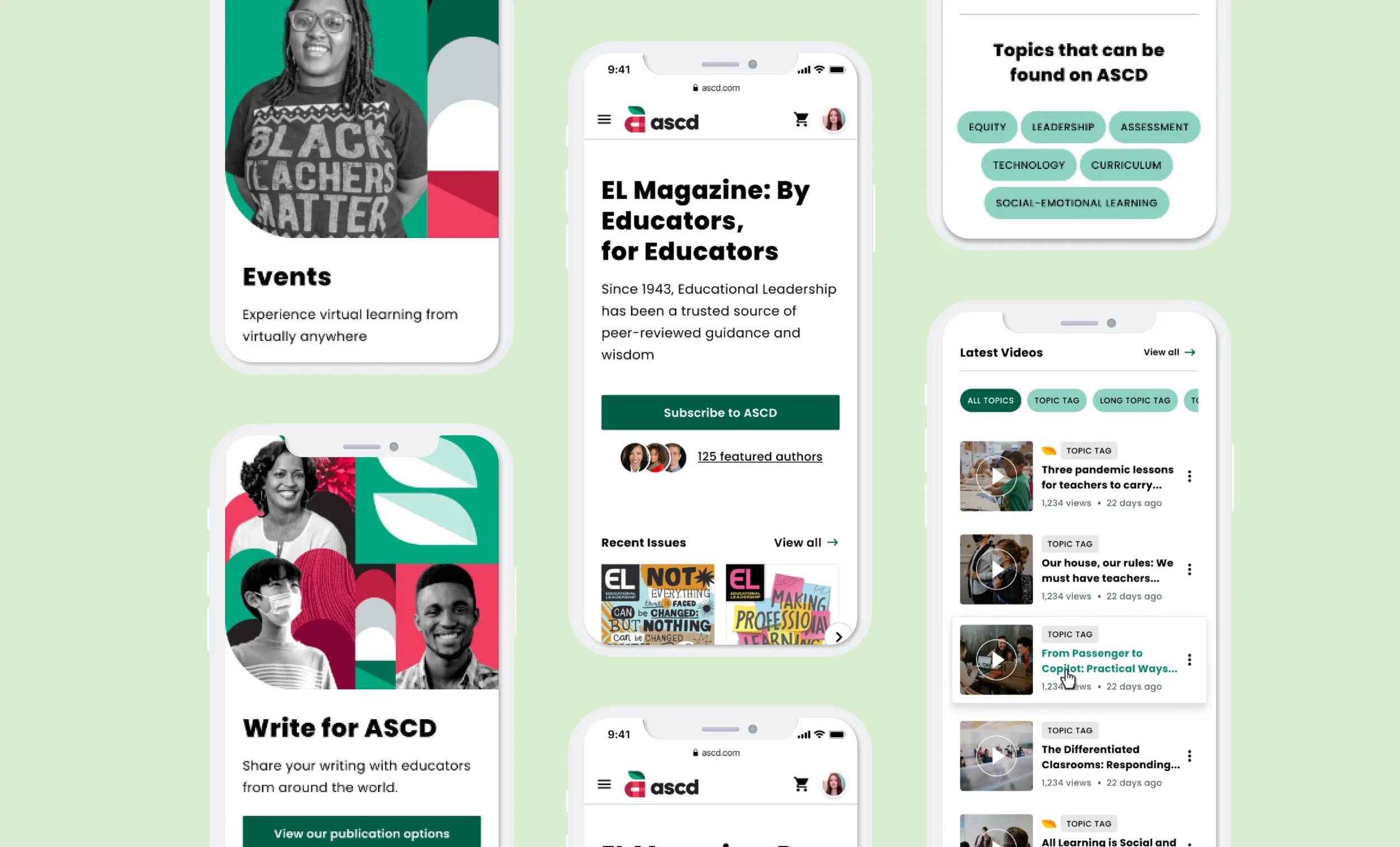
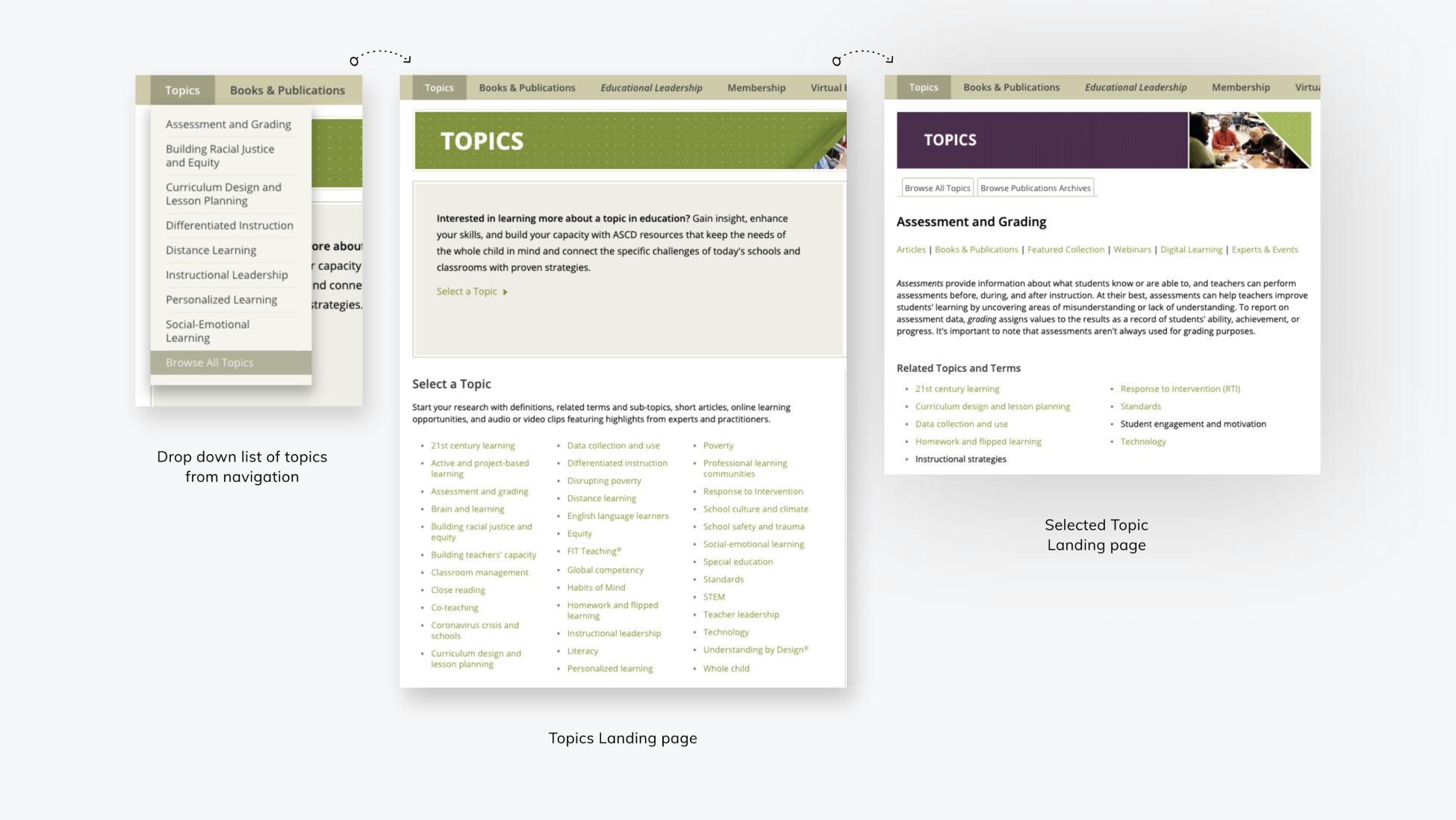
We revamped the topics navigation to better align with user behavior. ASCD features over 30 topics, many with lengthy and complex names.
Users had voiced concerns of 'confusing labelling', 'too many links', and 'not sure what topic this is'. So instead of topic categories that are too specific and non intuitive like 'building radical justice and equity' and 'social and emotional learning', we grouped the topics in more general and easy to understand buckets like 'equity' and 'curriculum'
Previously, “Topics” was the first menu item, featuring a list of most-viewed topics. However, research showed users preferred starting with content types (e.g., blogs, books, videos) and refining by topic later. We reorganized the navigation to prioritize content types, streamlining the user journey and making it more intuitive.
Key findings from Audit
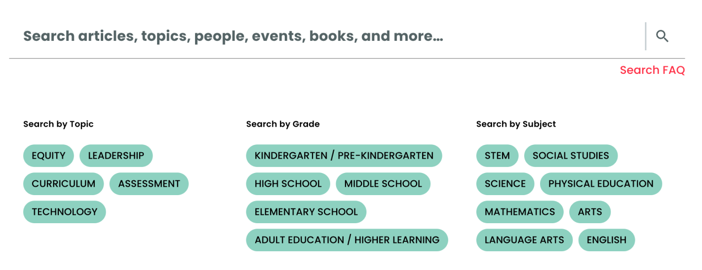
The new navigation has an updated hierarchy of grouping; Resources, Events, Services. In order to assist users when they do want to filter the material, we placed suggested filter guides in the search suggestions (search by: topic, grade, subject). This update allows for topic to be part of the search flow, which suites the users’ journey better - focusing on the content first.
Updated and simplified ‘topics’
Membership
Home
User comments on ASCD experience
Store
Updated Navigation
Feature 2
Brand Update
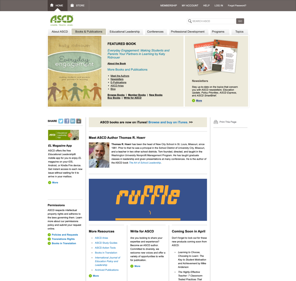
The previous website was full of dead end links, outdated designs, and overall lacked design consistency. This created friction and confusion for the user that stumbles upon these pages because of the drastic difference in appearance.
Books & Publications
A common complaint we got from user research was that overall there was too much content, it was hard to find the pages/links they needed and that the overall clutter made the site overwhelming. The inconsistent designs contributed to the feeling of clutter and overwhelm. We collaborated with a design agency for a new brand style.
We collaborated with the design team from ASCD for branding updates. The apple logo mark represents knowledge and education, a universal symbol. The rounded elements, geometric shapes and colour add to a new fresh on ASCD, while speaking to ASCD's mission of diversity, equity and inclusion.
in bounce rate
New Branding Elements
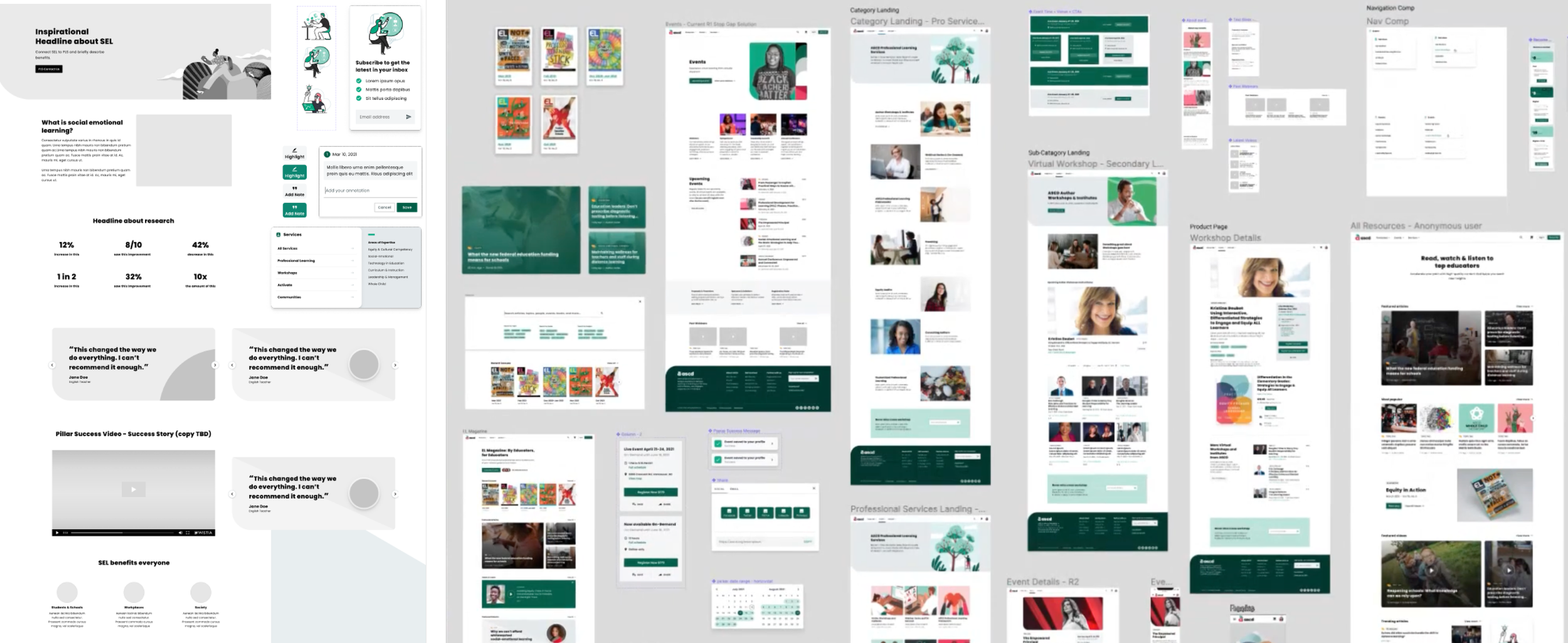
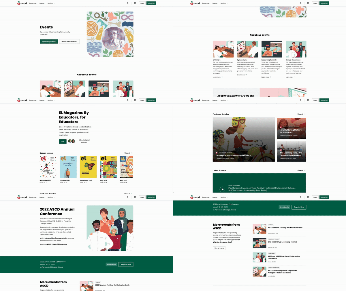
we applied the updated design styles as well as adding visual hierarchy between each content blocks, including prominent buttons with each component to make scrolling through events pages easier.
New Branding Elements
Events
Books
EL Magazin
Feature 3
New Reading Feature
Lots of ASCD users voiced concerns that on content on ASCD is hard to find, the long articles just feel like a 'wall of text' and that it is hard to navigate through an overwhelming amount of resources on the site. Research backed up the complaints and showed that there are 75k live pages, most of which are archived pages, and 85% of the pages are underperforming. ASCD users, who regularly consume large amounts of reading material, needed a more engaging and manageable way to interact with content. We explored different ways to create a user first experience that makes long written content easier to digest and navigate.
As I thought to update the way users are reading online, I dug into competitors on how 'long from content' is treated. I looked at document reader platforms, books, and article/recipe platforms.
Most provided basic functionality like saving or bookmarking articles, highlighting sections, or leaving comments for the author.
Competitor analysis of ‘long form content’
Navigation
Through our research on long-form content features, we looked at platforms with long form content (blogs, article, books, document app, etc) offering interaction options for written content. Most provided basic functionality like saving or bookmarking articles, highlighting sections, or leaving comments for the author. However, we identified a gap: users lacked the ability to personalize the content as they engaged with it. Features like taking notes directly on the article or sharing a specific section with a friend were missing. These insights guided us to prioritize tools that allow users to make the content their own, enhancing engagement and usability.
Building on our competitor analysis, we identified that enabling users to take notes and highlight text, much like they would on paper, could significantly improve content retention and engagement.
in page views per user
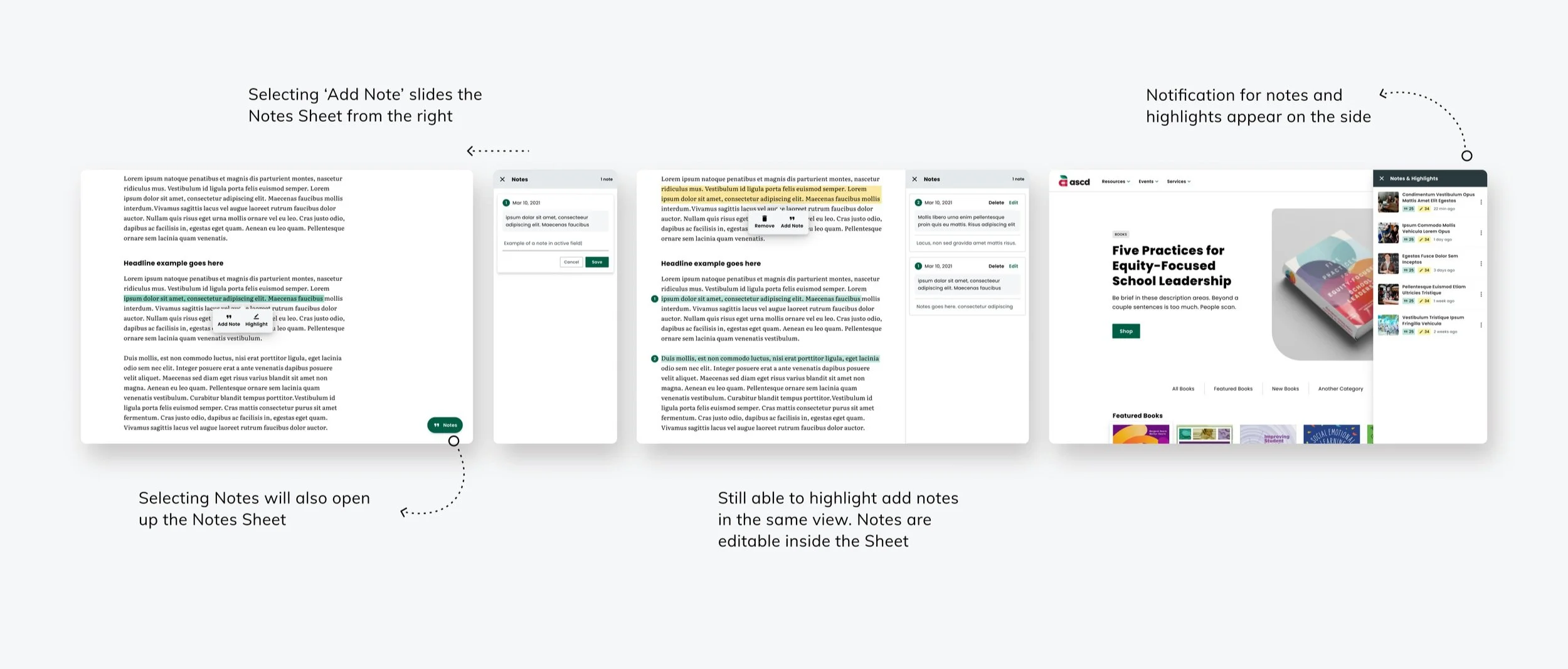
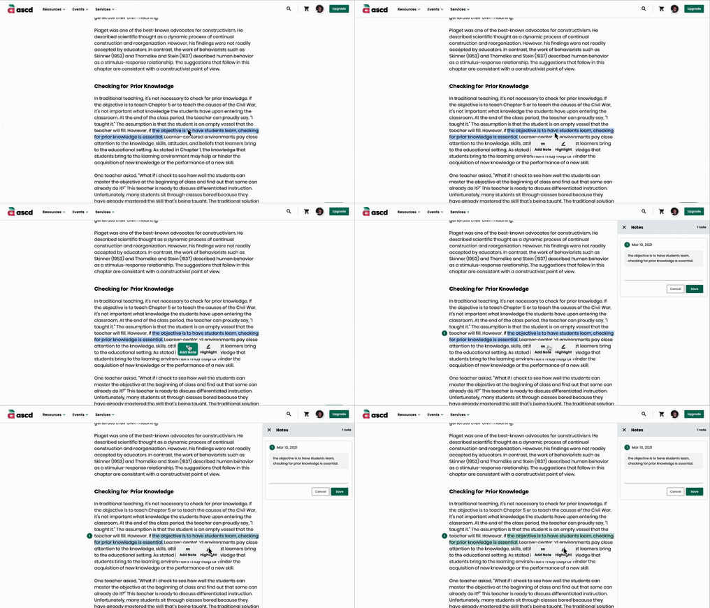
The desktop view offers an enhanced user experience, allowing users to view both the document and their notes side by side. As the notes slide in from the right, they seamlessly integrate into the interface, enabling users to reference or edit their notes without losing sight of the document. This layout ensures a streamlined workflow, making it easier to engage with content and annotations simultaneously.
Notes & Highlights feature
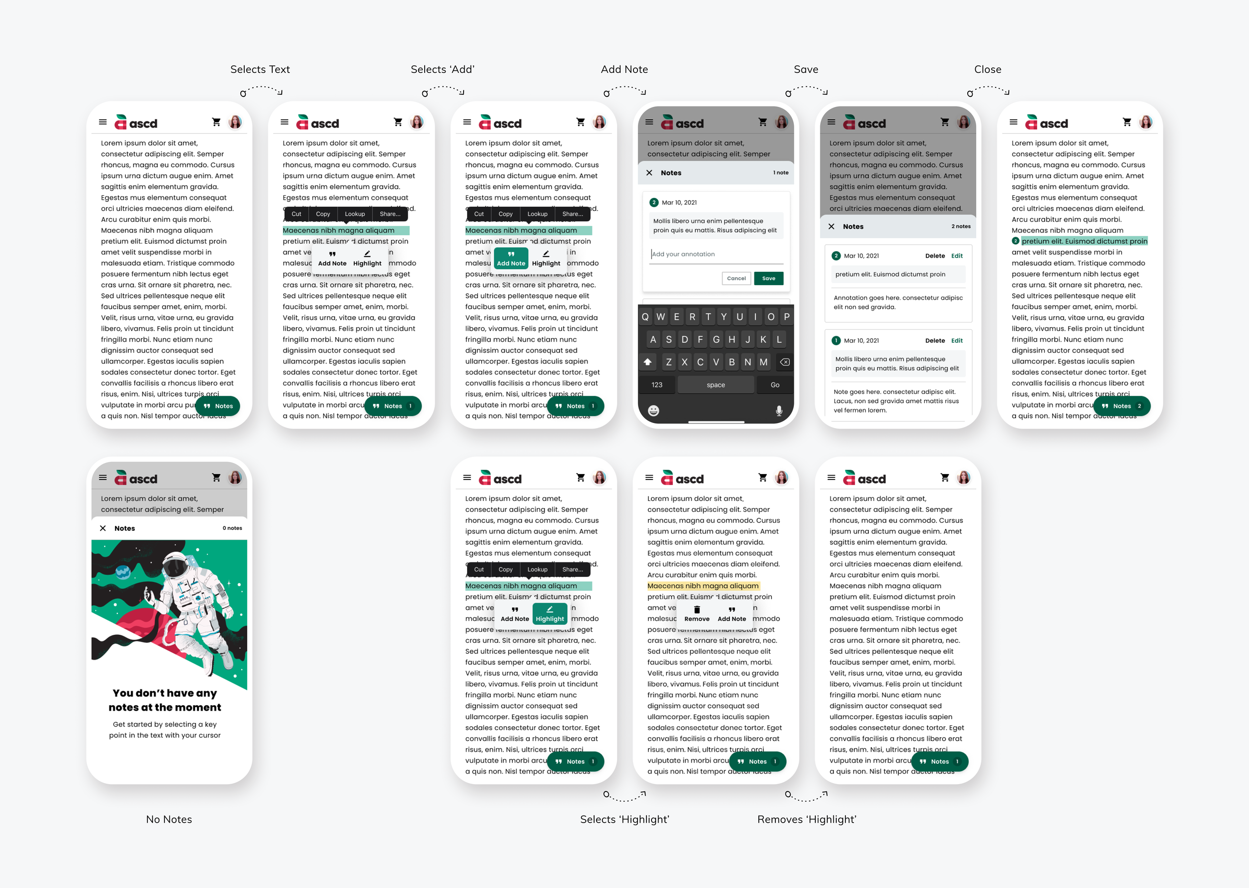
Notes & Highlights Flow
The new ASCD Notes feature lets users interact with content seamlessly. By selecting a passage and holding it down, users access the Notes/Highlight dialog. Choosing “Add Note” opens a sliding Notes Sheet with the selected passage displayed and a field to enter their note. Once saved, the passage is highlighted, and the Notes Sheet allows users to view and scroll through all their notes. A snackbar at the bottom indicates the total number of notes made, while numbered highlights provide clear visual organization.
Highlighting follows a similar process. Selecting “Highlight” in the dialog applies a distinct color to the passage for easy differentiation from notes. Users can tap a highlighted passage to edit or delete it, maintaining full control over their interactions. These features create a more dynamic and personalized reading experience for ASCD users.
Desktop view of Notes & Highlight feature
Metrics
In the month after its launch, we saw
Video & Podcasts
25% increase
13% decrease
users are more engaged with the website and its content, the updated ASCD has created a more efficient and enjoyable user experience for educators.

